-
Activision: Call of Duty®: Black Ops 4 Zombies
Snapchat Lens

-

Prey: Transtar Awaits
Interactive Website

-
Wolfenstein: Du Hast Strife
Interactive Website

-

Disney: Make Every Day Magic
Interactive Website

-
Applebee's: Applebees.com
Interactive Website

-
Crocs: Brick Breaker
Interactive Banner

-

Norwegian Air: Best Free Shipping on Earth
Interactive Website

-
Braintree: Crack the Claw
Experiential Fabrication

-
Braintree: Talks
Website Updates

-

9 Lives: Cat's Eye View
Interactive Website

-
Domino's: DXP
Interactive Microsite

-

Domino's: New Year's Eve at Home
Interactive Website

-
Paypal: New Money
Interactive Experiential

-
Gears of War: Ink
Interactive Website

-
Jackrabbit: Brand Page
Interactive Website

-

Fruit of the Loom: GIF Registry
Interactive Website

-

Fruit of the Loom: Naked Cowboy
Interactive Website

-
Fruit of the Loom: Dadisms
Interactive Website

-
Fruit of the Loom: Crew and Ladies
Interactive Website

-

Human Rights Campaign: #loveconquershate
Interactive Website

-

JCPenney: Just Got Jingled
Interactive Website

-
Kraft: Jello Recipes
Interactive Website

-
9 Lives: Live Well and Prospurr
Interactive Website

-

Nature’s Recipe: Make it Real
Interactive Website

-
Metlife: Local Branch
Facebook App

-
ChildObesity180: Mom Power Hub
Interactive Website

-
Natural Balance: Natural Characters
Interactive Website

-
Old Chicago: Beat the Leader
Interactive Website

-

Ryder: Ryder.com
Interactive Website

-

Charles Schwab: Fee Weight
Interactive Website

-
Street League: Trick of the Year
Interactive Website

-

Warren Miller: Ticket to Ride
Facebook App

-
VFW: Mane Event
Interactive Website

-
Aspen Dental: AspenDental.com
Interactive Website

-
Spark: Homepage
Interactive Website

-
Greenstone: Official Site
Interactive Website

-
Whole Foods: Hennepin
Interactive Website


Activision: Call of Duty®: Black Ops 4 Zombies
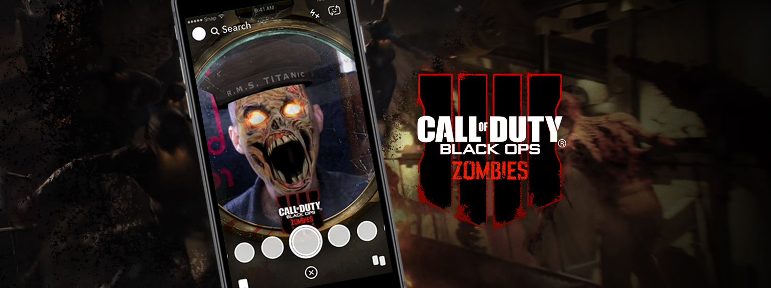
Ever wanted to know what it was like to be on the Titanic? Ever wanted to be a Zombie?! With the new Call of Duty - Black Ops 4 Zombies game module being released in Fall of 2018, Black & Red teamed up with Midnight Oil Agency to deliver a Gamestop-exclusive Snapchat zombie lens to promote the game! You too can be part of the evil undead horde!
With only 3 weeks to design, review, test, and deliver the lens, we put the rubber to the road and dove in zombie-head first! Check it out! Let us know if you need a custom Snapchat Lens.
Project Info
-
 Midnight Oil
-
 Activision
-
 #Interactive



Prey: Transtar Awaits
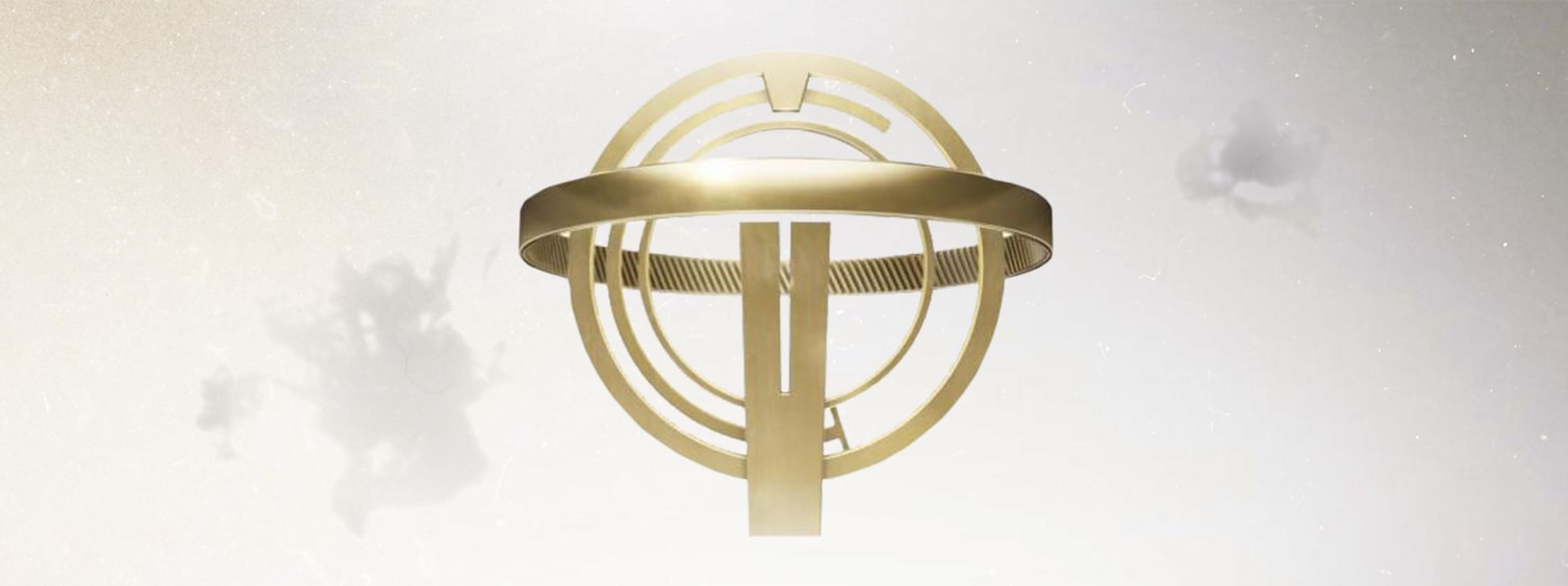
The creative gurus at Midnight Oil had an incredible vision to promote the release of Bethesda’s new video game, PREY. They imagined a visually stunning microsite where potential gamers could get a real glimpse into their terrifying futures aboard the Talos I space station, and envisioned a space for users to share their excitement via social media before the release of the game.
Eight weeks later, Black & Red made the vision a reality. To mirror the aliens in the game, we built custom animations that warp from creepy Typhons (spider-like aliens) into Rorschach ink blots in a 10-question quiz that will determine if you’re good enough to make the cut aboard Talos I. Amid other cutting-edge graphics including constantly changing, dynamic background animations, Black & Red also introduced complex video asset compositing for social share. This feature allowed users to download a six-second video of their Talos I badge, with their own face on it and Typhons creeping across it, to upload to Facebook or share with their friends.
Seamless animation transitions, innovative graphics and the ability to turn lifeless ink blots into dynamic, carefully crafted Typhons made this project a true test of Black & Red’s development and creative abilities, which we passed with flying colors -- or Typhons, we can’t seem to get those creepy aliens out of our heads.
Project Info
-
 Midnight Oil
-
 Bethesda Game Studio
-
 #Website, Interactive
-
 View Project

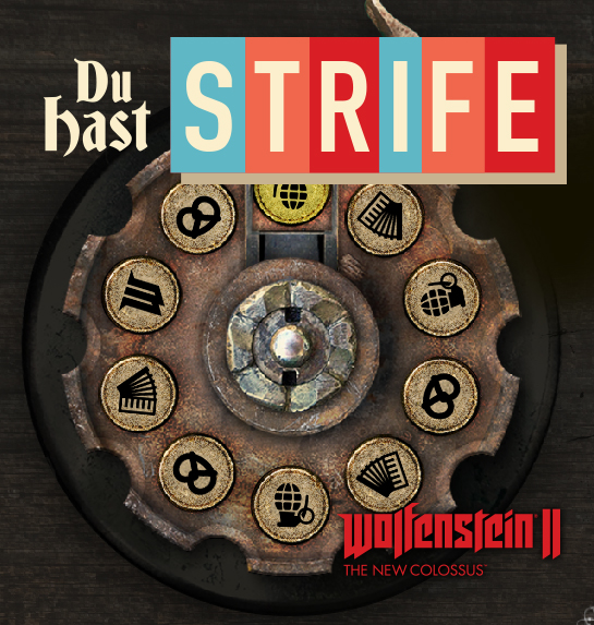
Wolfenstein: Du Hast Strife
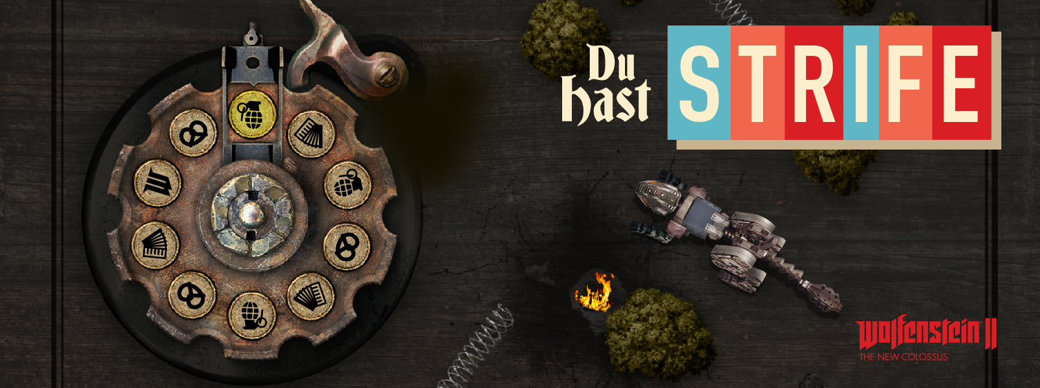
Bang Bang, Pew Pew! Those are some of the sounds you’ll hear in Wolfenstein: The New Colossus, the follow up to Bethesda’s hit Wolfenstein: The New Order. As avid video game nerds and/or dorks, we couldn’t have been happier to use our web expertise to help promote this alternate-timeline, nazi-robot, FPS. Midnight Oil wanted to build Du Hast Strife, a 9-week sweepstakes with daily instant-win prizes, working in tandem with Bethesda and Game Stop. We knew a thing or two about that kind of thing so we built the thing!
The site was built to emulate a living board game that players could advance on every week. It had a strict artistic layout that featured numerous high-fidelity animation sequences that played on a constant, seamless loop on all browsers as well as mobile devices. Flames, cars and creatures all leap from the screen to invite users to take part in this sweepstakes that has to be witnessed to be experienced.
Project Info
-
 Midnight Oil
-
 Bethesda Game Studio
-
 #Website, Interactive
-
 View Project


Disney: Make Every Day Magic
Just because we spend our lives huddled over a computer screen, researching the next hot technologies and writing hundreds of thousands of lines of codes doesn’t mean that we don’t cry when mufasa dies in the Lion King. We were enchanted when Midnight Oil approached us to build Make Every Day Magical, a sweepstakes microsite for Disney. The site needed to be built in 3 weeks and would allow for users to participate in a 6-week sweepstakes with daily instant-win prizes along the way. It also needed to showcase an assortment of beloved Disney characters in full, high-fidelity animation.
It came as no surprise that this site would have to exhibit a fine level of polish, given the prestige of the client. This project came with stringent branding and legal requirements and experienced over a million visitors. For this reason, cyber security became more important than ever. Given Disney’s renown for animation, the animations here utilized PIXIJS for smooth and colorful plays that worked beautifully on both Desktop and Mobile devices. Black & Red worked in tandem with multiple tech teams, as well as multiple creative teams as the site displayed characters from Disney, Lucas Films, and Marvel Studios. After a photo-finish development/QA cycle, and a seamless launch, the site was a huge success and went on to meet & exceed predicted user volume!
Project Info
-
 Midnight Oil
-
 Disney
-
 #Website, Interactive

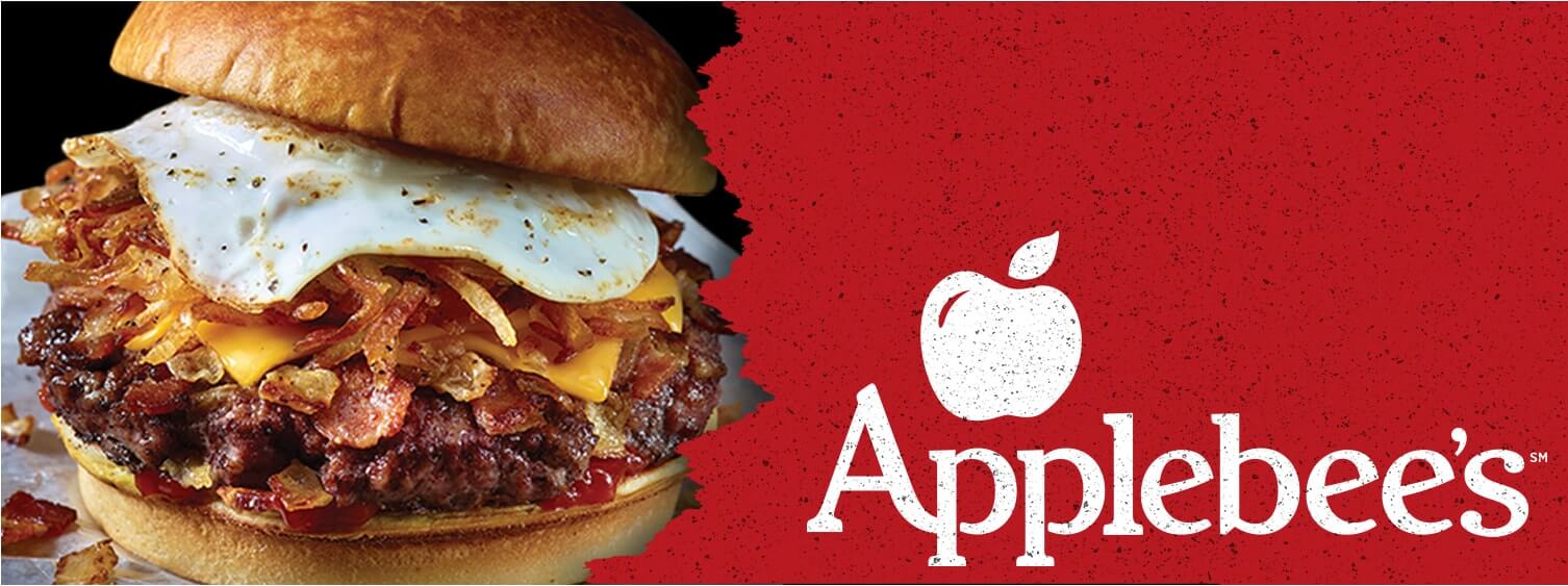
Applebee's: Applebees.com
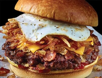
Black & Red was contracted by Crispin Porter + Bogusky for over a year to complete all of updates required for Applebees.com. These updates included Applebee's Featured Menu page which made for a large addition to their websites content. The site ran on sitecore, a .NET framework, which made Black & Red a perfect choice with their experience in .NET. Multiple promotional pages were built throughout the year, with geolocating enabled to serve users with details & promotions specific to their local Applebee's restaurants.
After the one year contract, Black & Red was brought on again for another couple of rounds of Applebee's updates. The C3 campaign included updates to the handheld page and a landing page that would eventually become the Featured Menu page. Black & Red was able to bring their diverse programming experience to the table for this contract, and integrate with the existing Applebee's infrastructure.
Project Info
-
 CP+B
CP+B
-
 Applebee's
-
 #Website
-
 View Project

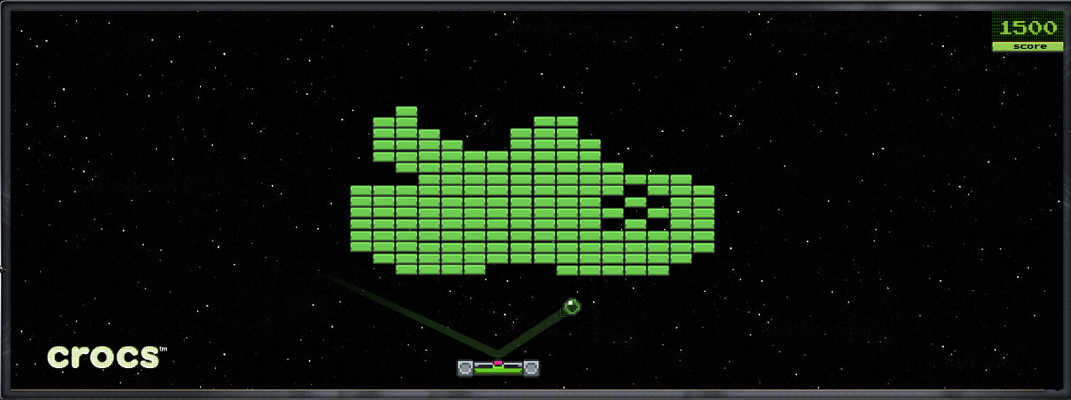
Crocs: Brick Breaker
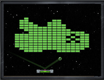
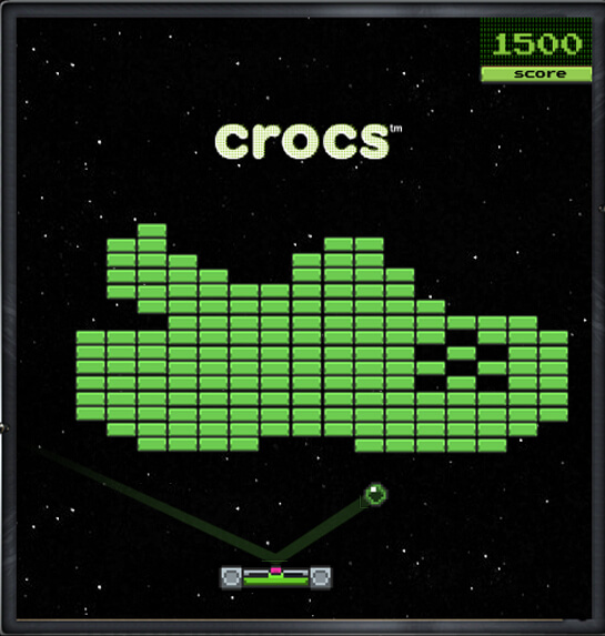
Web banners have always been a huge part of what we do here at Black & Red, as we adore beautiful designs and problem solving in animation. Every now and again we get a project that, not only produces a delightful example of web advertising, but is also a blast to build. The game of Brick Breaker is no secret to anyone, young to old, Nintendo to iPhone 6.
When Crocs came to us to build them an interactive expanding Brick Breaker web banner in the shape of one of their signature shoes, we were overjoyed to revisit this old classic. The banner allowed users to engage in a full round of classic Brick Breaker, which was not necessarily easy to win (our quality assurance team loved and hated us), and users were presented with different value coupons depending on their final score. Firework animations were even added to the end screen for winners!
Project Info
-
 McKinney
-
 Crocs
Crocs
-
 #Interactive #Banner


Norwegian Air: Best Free Shipping on Earth
Dubbed “the best free shipping sale on Earth,” Norwegian Air’s five-day Flash Sale campaign set out to disrupt the traditional “flash sale” idea. Typically, flash sales entice users to buy things at heavily reduced prices within a (usually short) time period. In this case, instead of having items shipped to people, Norwegian Air shipped lucky winners themselves to their selected items for free. Users would choose an item up for grabs before the clock ran out, and enter their info to enter the sweepstakes.
With only three weeks to build the microsite, at the peak of the holiday season, Black & Red pulled off the launch flawlessly. The animation-heavy site wasn’t easy to create: each animation had to interact with the rest in order for the flash sale to work properly. Each time a new item from Norwegian Air’s international collection went on sale, an email would automatically be sent to all users who had signed up to alert them. Once that item expired, a new one would rotate to the prime spot and take its place -- this chain reaction continued with 20 prizes over five days. Between the complex animation interaction on the site and the time-sensitive email campaign, the flash sale promotion required that everything be synced perfectly, with no room for error.
Within three minutes of the first item going live, there were close to 1,000 submissions for the first item’s sweepstakes. Soon, we had 1,000+ interactions on the site each minute, and 100,000+ submissions for the sweepstakes overall.
Project Info
-
 McKinney
-
 Norwegian Air
-
 #Website, Interactive


Braintree: Crack the Claw
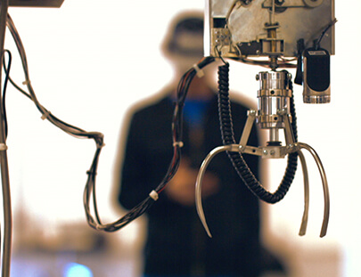
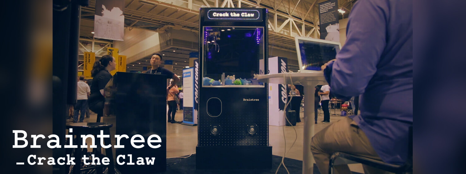
Remember that claw game you used to play as a kid; the one filled with stuffed animals or candy prizes that you could win if you had enough quarters, time, and dexterity? Brain Tree was looking for an interesting physical technology piece to use at trade shows during the summer of 2016, and reached out to Black & Red with an RFP for a custom claw machine. Within four days, Black & Red purchased a claw machine, interfaced with the electronics, and built a prototype machine that could be operated remotely through the internet with a webcam. This prototype was presented with our proposal, and winning the project was a slam dunk.
In the completed project, users would navigate to a web app on their cell phones, and after completing a short survey and answering a few tech questions, would be given a chance to operate the claw machine using their cell phones only. Complete with a live-streaming, downward facing camera located inside the machine. By combining classical analogue technology and concepts with modern digital ideas, this seven foot pillar was the highlight of Collision trade show conference.
Black & Red built all of the physical electronics in house, and designed all of the software systems for the machine. Fabricators, vinyl shops, and shipping/crating vendors helped rebuild the machine to double it’s original size. The primary difficulty for this project was bringing all of the pieces together and making them work harmoniously and simultaneously. The Claw Machine featured over 1000 RGB LED lights, a bumping (1000Watt!) interactive speaker system, a fully animated LED marquee board with custom animation, a web-app with custom interface, a digital joystick and custom vinyl graphics for the exterior of the machine. Together, 12 servers worked together to create an exciting and memorable user experience. Designed for high-traffic crowds, with a built-in queueing system, the Claw was played over 2500 times at its first trade show, in just 3 days The project generated more buzz and excitement than was ever anticipated! Two machines were built: One currently is on tour throughout the United States, and one lives in the lobby of Brain Tree’s corporate offices.
Project Info
-
 CP+B
CP+B
-
 Braintree
-
 #Experiential #Fabrication

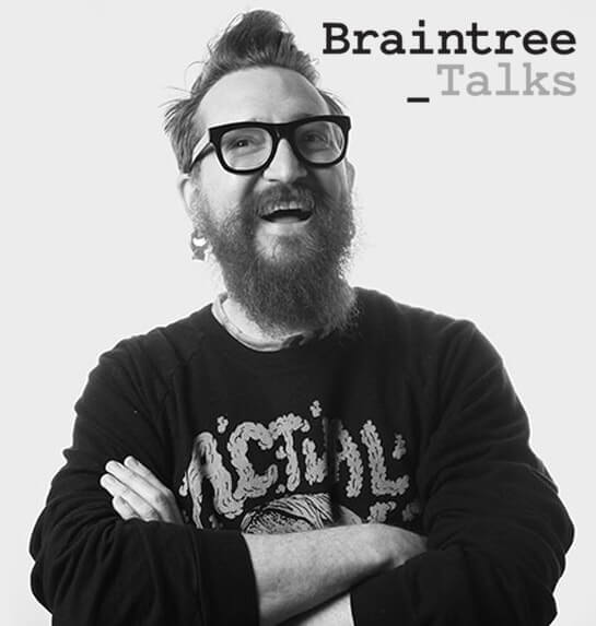
Braintree: Talks
Braintree: Talks was created as a promotional and informative site for Braintree hosted events. The immediate problem that they faced was that it was crafted with only one event in mind. As they grew, the need to host more talks established the need for a site that allowed for this multiplicity. Black & Red was brought in to tackle the page.
From the ground up we implemented new features and structure to make Braintree: Talks work the way they needed it to. We structured the site in a way that allowed for their internal team to more easily update and edit their site. From this one site, we developed a boiler plate that we would go on to use for many more projects.
Project Info
-
 CP+B
CP+B
-
 Braintree
-
 #Website #Updates


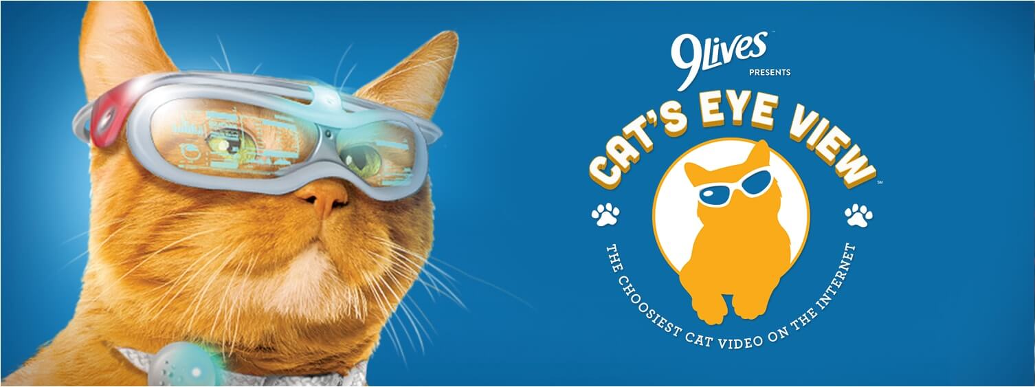
9 Lives: Cat's Eye View
Morris the Cat has been a household name since the 1960s. The time had come to bring him into the modern age of technology.
Cat’s Eye View was produced as a hilarious interactive adventure behind the eyes of the famous feline. Combining a series of fun videos and animations into a Choose-Your-Own-Adventure style of game, users could live a life in the shoes of their hero. Through the microsite, users would enter a fullscreen video experience that simulated the view through Morris’s feline eyes. After each short video experience, users had the option to tell Morris what to do next. An elegant architecture allowed for seamless video transitions as well as optimized load times to allow for a clean video experience. Easter eggs were placed throughout the experience for users to click on, and the eggs ranged from vintage Morris commercials to the grand prize of a year’s supply of 9Lives cat food!
Winner of an FWA award and featured in Adweek, Adage, NY Times and the Chicago Tribune, Cat’s Eye View remains fully active today and was a huge success at its launch. The experience was inspired by the rides of Disneyland, which is probably why it was so fun to craft. Even though the task of bringing it to life was massive in scale and required many, many work hours, the site production and launch was completed in only 4 weeks!
Project Info
-
 Evolution Bureau
-
 9 Lives
-
 #interactive #digital #Website

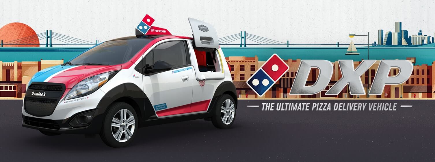
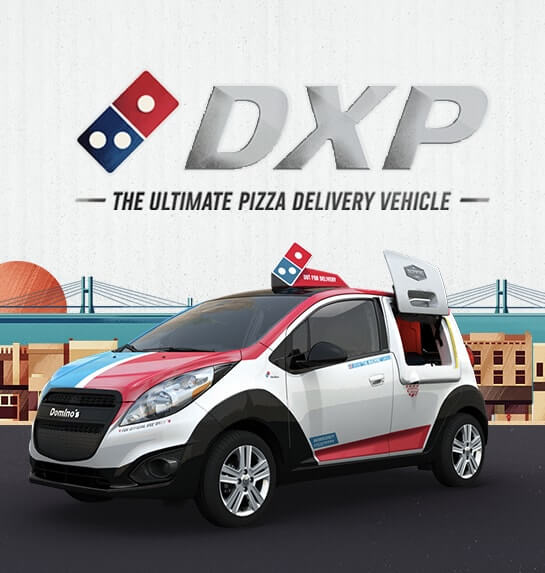
Domino's: DXP
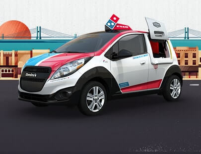
Domino's DXP was a very cool and stylistically designed microsite. Black & Red worked together with a second team to make something that functioned flawlessly and inspired immersion through perfection. The site depicts the first pizza delivery vehicle built by Domino's on a journey through a beautifully designed and delightfully informative world.
Black & Red was brought on to handle a number of complex interactive components and handle numerous bug fixes that were holding DXP back from realizing its vision. The final product was a gorgeous and visceral website that adequately promoted the campaign and provided users with an interesting way of learning about this unique vehicle.
Project Info
-
 CP+B
CP+B
-
 Domino's
-
 #interactive #Website


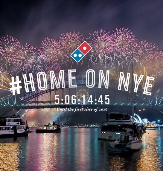
Domino's: New Year's Eve at Home
This was another project that highlighted Black & Red’s role as a top notch clinch-in-a-pinch team. This one was dropped on our doorstep with four weeks until the sharp deadline of December 31. With no creative to work from, Black & Red worked night and day in tandem with CP+B's design team to structure a skeleton that we could skin when the visuals arrived.
This was a strong moment of two teams working parallel to produce an immaculate big-name website, representing a large enterprise. NYE at Home featured multiple interactive modules including animations, quizzes and a “Heat Map” that integrated the Domino's API to display where in America Domino's pizza was being ordered and how much. With such a rapidly approaching deadline during the holidays, there was no team but Black & Red who could pull it off. It was a fast paced project, with final creative assets arriving up until the last day. The site passed quality assurance testing the day before New Year's Eve, and the project went off without a hitch!
Project Info
-
 CP+B
CP+B
-
 Domino's
-
 #Website


Paypal: New Money
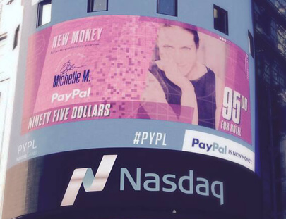
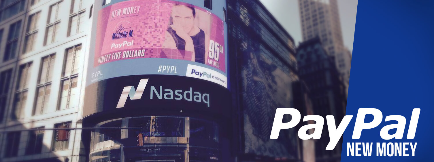
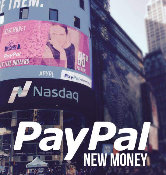
The New Money project was a unique and creative project from Paypal. To announce the company’s independence as a publicly traded company, the Folks at Paypal wanted to show the public what the future of cash could look like by putting their own face on the bills… on a major Times Square billboard. This project required some real coding chops and problem solving skills, but in the end, the final result was nothing short of spectacular.
The scene was set below the main Nasdaq billboard. Participants would walk by, see the commotion and promotional materials (including free doughnuts), and investigate. Located there were photo booths that would snap their photos to later be displayed on the big board. After entering their information, the user photos would be added to a database and later selected for display using a specially designed “Decay Algorithm” that would select photos semi-randomly using time, and number of iterations to determine which photo deserved to be displayed most.
The New Money promotion was an extremely unique project that required varied levels of out-of-the-box problem solving, immense screen sizes, clever use of the internet, participation with the local public and integration with the material world. In the end, it all went off without a hitch, with every seam stitched and every fold ironed. The project gained attention from many major publications including The New York Times and The Wall Street Journal and garnered around 2.5 million social media impressions.
Project Info
-
 CP+B
CP+B
-
 Paypal
-
 #Interactive #Experiential

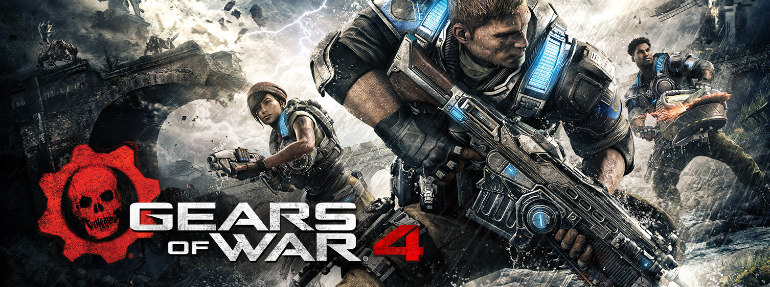
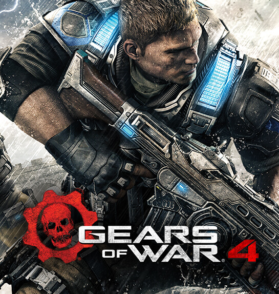
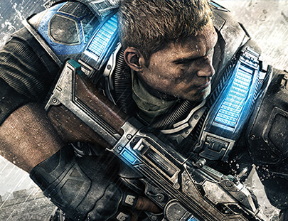
Gears of War: Ink
Gears of War: Ink was a contest campaign to promote the release of Gears of War 4. The site catered to superfans of the series, so dedicated that they went out and got a GoW tattoo. The contest encouraged players to upload a photo of their tat through Twitter, Instagram or Facebook with the hashtags #Gearsink and #Contest. The grand prize winners were awarded a new Gears tattoo to complement their original.
This project posed some unique challenges as well as a few typical to our niche skill set. Atop a very strict and short deadline, the site had to be interfaced with xbox.com and their ordering system. Due to xbox.com’s web security, the site had to be constructed locally which means that we were unable to test it for successful integration. The code had to be right the first time. Thankfully our crew knew what they were doing and are sticklers for detail. The site launched without a problem and champagne bottles were popped.
Project Info
-
 The Martin Agency
-
 Xbox
Xbox
-
 #Website

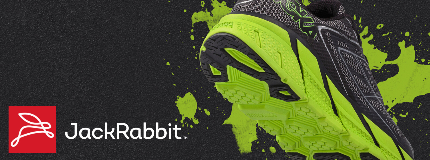
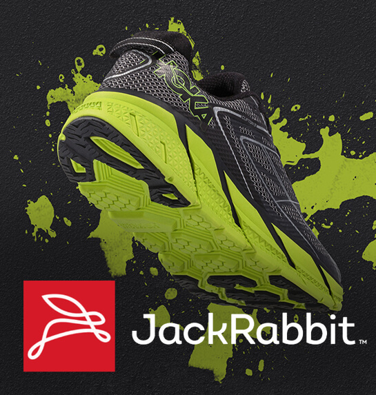
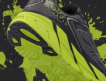
Jackrabbit: Brand Page
Jackrabbit.com is a popular fitness site among people who like to run. A large portion of their site is given to the brands that they work with. Nike, Adidas, The North Face and many others are featured there. Jackrabbit wanted to update their brand pages with a new layout and more content. What we built for them was a kind of microsite generator that allowed them to display and add brands in a whole way.
This was no easy task. In order to give them what they were requesting, our team had to interface with a legacy system and pre-existing CMS. In the end, Jackrabbit was able to generate new pages for their brands in desktop, tablet and mobile formats. These pages included videos, carousels, Instagram feeds and shopping cart components all contained in a sleek and stylish layout.
Project Info
-

-
 Jackrabbit
-
 #Website

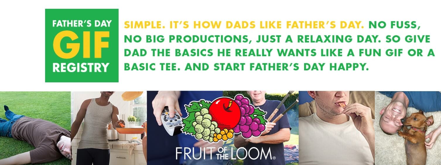
Fruit of the Loom: GIF Registry
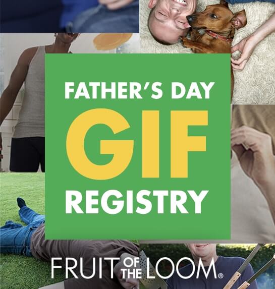
During the Father's Day promotions, Fruit of the Loom launched their Father's Day GIF Registry campaign, which allowed users to send animated GIFs with personal vouchers via email. Black & Red was brought in to complete all development work for the campaign. A microsite was built for the campaign which included an animated GIF gallery, email integration and social media hooks. The bread and butter of the campaign was a custom email generator that allowed users to select a GIF from the microsite, attach it to a custom email, and mail it to their fathers. The campaign went off flawlessly, with a huge number of emails being generated from the site!
Project Info
-
 CP+B
CP+B
-
 Fruit of the Loom
-
 #Website

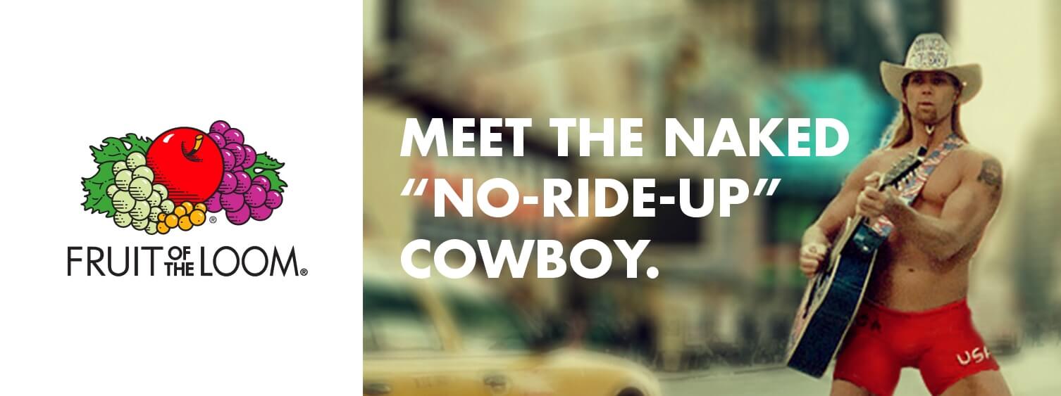
Fruit of the Loom: Naked Cowboy
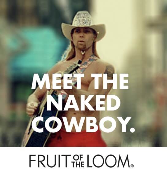
Robert John Burck is a street performer who took on a huge amount of popularity when he took on Times Square in New York City. In early 2014, Fruit of the Loom, Crispin Porter + Bogusky, and Black & Red ran the Naked Cowboy campaign in which users and the Cowboy himself posed for pictures live. Images were uploaded and shared via Start Happy HQ (a Fruit of the Loom microsite built by Black & Red) Instagram, Facebook, and Twitter social media outlets.
Along with social media outreach and integration, participants posed behind cardboard cutouts of underwear models. Throughout the day, these photos had a chance at hitting the Times Square billboards and could later be accessed via the website.
Project Info
-
 CP+B
CP+B
-
 Fruit of the Loom
-
 #Website

Fruit of the Loom: Dadisms
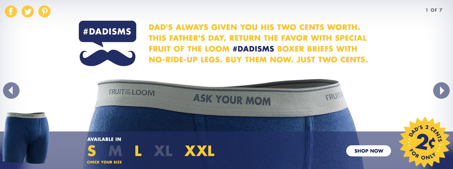
Crispin Porter + Bogusky contracted Black & Red to build the Fruit of the Loom Father's Day Dadisms promotion for desktop and mobile. Black & Red built a full microsite for the promotion in which users were able to purchase underwear in real-time. Features included an adaptive image carousel, Amazon Integration, social media hooks, and a live inventory ticker for keeping track of remaining underwear inventory for the promotion.
The campaign was so wildly popular that even the Black & Red crew were unable to purchase any of these limited edition pairs of underwear for our own fathers before supplies ran dry. Dadisms included: “Ask your mom”, “Never date a drummer”, and “Go with your Gut.”
Project Info
-
 CP+B
CP+B
-
 Fruit of the Loom
-
 #Website


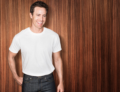
Fruit of the Loom: Crew and Ladies
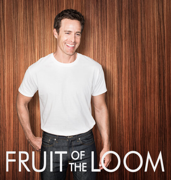
Fruit of the Loom had just released their new line of Stay-Tucked tee shirts. Alongside these men’s tee shirts was the release of Ladies Breathable Micro-mesh panties. Since both products were being released side-by-side, both promotional websites should use the same formula, right? Well that’s what Fruit of the Loom felt when they came up with the Ladies and Crew Pages.
Both sites depicted a kind of visual tour of what made the products so special. User’s could click on bulleted photos to reveal visual information about the products. The client requested Pandora integration, so custom playlists were crafted that could be played on the sites. Both pages had full social media shareability, youtube embedded content and utilized Sitecore content management. Overall, it was a unique set of projects that brought together a multitude of fun little features into one grand package.
Project Info
-
 CP+B
CP+B
-
 Fruit of the Loom
-
 #Website

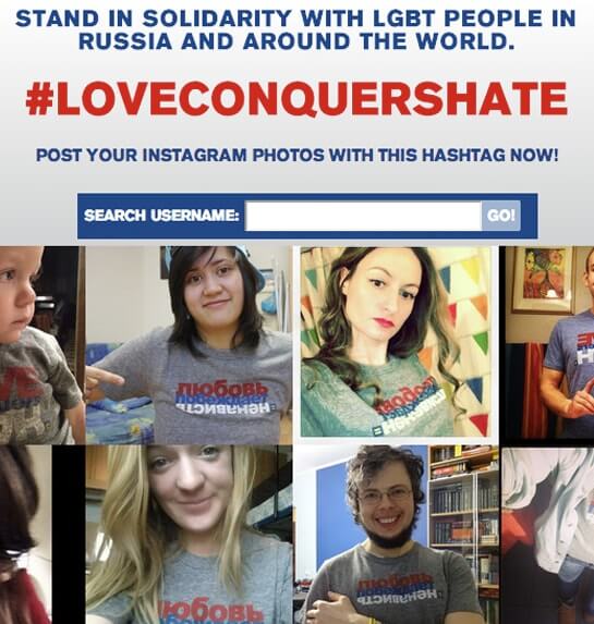
Human Rights Campaign: #loveconquershate
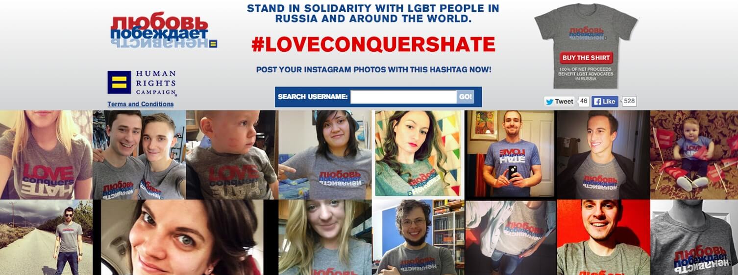
This was a unique project and not only because it was primarily intended for a Russian audience. Human Rights Campaign wanted a photo wall featuring a slew of Instagram photos utilizing the hashtag #loveconquershate. HRC’s goal was to spread awareness of LGBTQA ideals and raise awareness at a viral level. Users would spread love and understanding through use of Instagram and social media, then see the effect by visiting the microsite. HRC brought this project to MVMT, who then brought it to Black & Red to be completed by an OG.
The primary piece of the whole operation was the photowall. Other features included a search bar that allowed users to search for their own handle or for a friend’s to see their activity.
Project Info
-
 Movement Strategy
-
 Human Rights Campaign
-
 #Website


JCPenney: Just Got Jingled
JCPenney has always been a prominent face during the holiday season. In 2014, they conceived the project #JustGotJingled, an interactive holiday micrcosite riddled with treats. User activity would be tracked with the hashtag #JustGotJingled and it would act as the keystone in assembling all of the user-generated content into one location. #JustGotJingled combined social elements from all over the internet (Buzzfeed, Instagram, YouTube, Twitter, Weather.com, Facebook, etc. ) to create a media-heavy microsite, jam-packed with holiday cheer. On an extremely short timeline, Black & Red was brought in to deliver the project in time for the holiday rush!
Landing on the main page dropped users into a plethora of interactive activities. Featured at the top was a “Candy Cane Counter” which tracked the use of the two hashtags #Give and #Receive, pitting the two jovial terms against each other with a visual counter display. The site also worked together with Buzzfeed for symbiotic promotions and holiday themes. Live stream videos played various jingles and carols while a constant countdown to Christmas morning ticked away. All of these tools and pieces came together to build an impressive piece of internet real estate where almost any click resulted in a beautiful display of functionality. Happy Holidays!
Project Info
-
 Evolution Bureau
-
 JCPenney
-
 #Website

Kraft: Jello Recipes
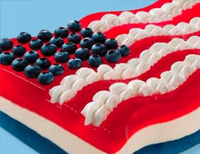
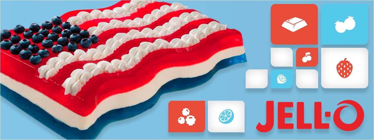
Kraft Jello needed a facelift for their new summer sales campaigns, and Black & Red was brought on by Crispin Porter + Bogusky to help. Work included a featured product carousel landing page, embedded YouTube player, modified grid layout, and flip based animation. This particular project was designed with a great amount of care in its color palette and delicious depictions of their products. This was a great example of sleek, jovial design coming together with smooth functionality.
Project Info
-
 CP+B
CP+B
-
 Kraft
Kraft
-
 #Website

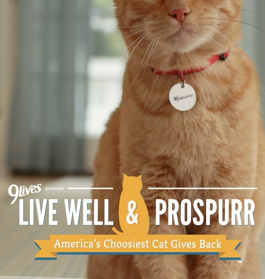
9 Lives: Live Well and Prospurr
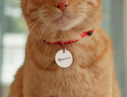
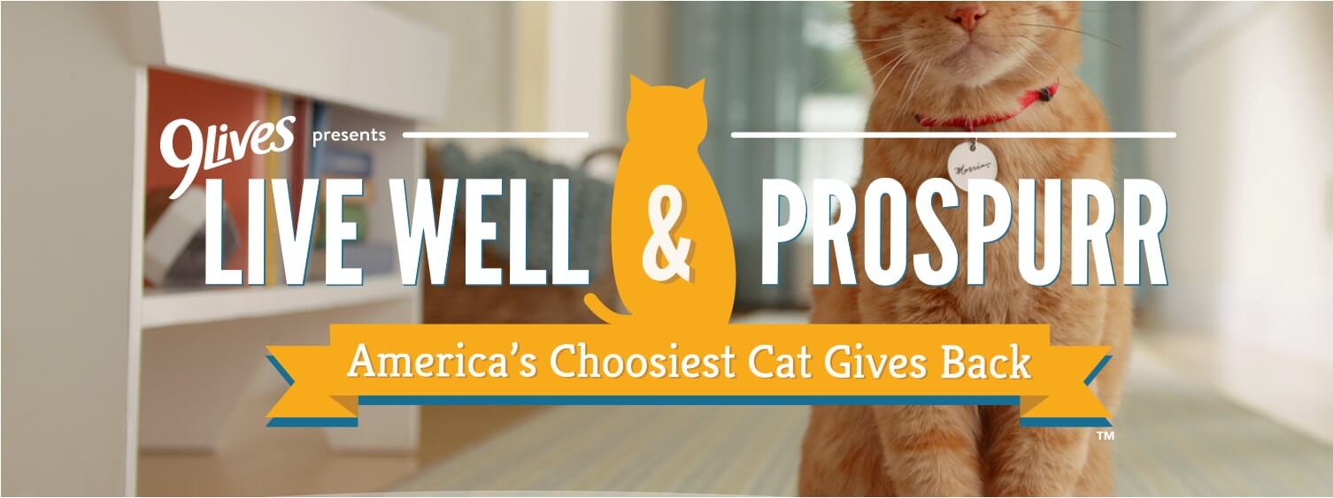
The time had come for 9Lives cat food and Morris the Cat to become active among the young web heads of the millennial generation. Live Well and Prospurr was conceived as a chance to learn from our cats who, more often than not, get to live the good life. Morris the Cat, with a history of over 50 commercials, movie cameos, books and more, has lived the greatest life a cat could imagine. Live Well and Prospurr would spread his message of good and healthy living to an audience that only the world wide web had access to.
A constantly updating sweepstakes was the core objective of the Live Well and Prospurr microsite. Over nine months, and through five different sweepstakes, users could upload images of their cats using Instagram hashtags, Twitter hashtags, Facebook, or a direct custom image uploader. Connected to a custom built content management system, 9Lives had the ability to moderate user submissions, control miscellaneous promotional links & images on the site, and select winners of each sweepstakes. Social awareness boosted Morris’s growing online presence, and gave many domestic cats the opportunity to shine in the limelight!
Project Info
-
 Evolution Bureau
-
 9 Lives
-
 #Website

Nature’s Recipe: Make it Real
Nature’s Recipe has always been about providing pets with nutritionally vibrant and tasty food. Healthy pets equal happy pets. Recipes for Real was designed as a competition whereby users could submit their pet’s likeness for a chance to, among other things, have them featured on Nature’s Recipe packaging and advertising. To do all of this, they needed an interactive way of reaching a global community. That’s where Black & Red became involved.
The Make it Real site utilized Instagram as the medium for users to enter the Make it Real sweepstakes. Using the hashtag #MakeItReal, users were able to submit photos of their pets for the competition. A backend content management system allowed brand managers to moderate user submissions. The site also featured unique interactive components such as a quiz section where correct answers about pet health and safety would result in special coupons on Nature’s Recipe products. In various locations, the microsite cleverly linked to Nature’s Recipes' primary site for more information on products and recipes for healthy pet food.
Project Info
-
 Evolution Bureau
-
 Nature's Recipe
-
 #Website

Metlife: Local Branch
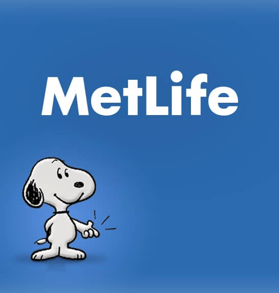
MetLife is one of the largest global providers of insurance, annuities, and employee benefit programs, so when they needed an app that would allow users to request an insurance quote from their individual agents' Facebook pages, Black & Red built a one-page, responsively designed form submission component for the customer to generate quotes featuring the friendly faces of Charlie Brown and his Dog Snoopy.
Project Info
-
 CP+B
CP+B
-
 Metlife
-
 #FacebookApp

ChildObesity180: Mom Power Hub
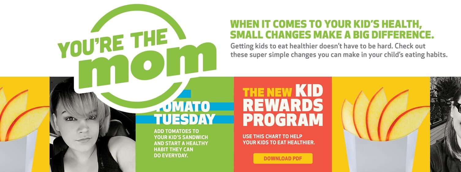
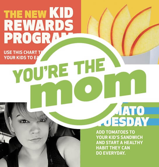
Mom Power Hub was a simple site that we were brought on to produce from the folks at Victors & Spoils. The goal of the page was to promote healthy eating habits for today’s youth and the moms who provide for them. This particular site displayed a plethora of eye-catching color and clean design. Ripe with information, light-hearted GIF animations, and social media shareability, Mom Power Hub came out looking great, reacting as intended and, due to its noble cause, was produced at a discounted rate.
Project Info
-
 Victors and Spoils
-
 ChildObesity180
-
 #Website
-
 View Project

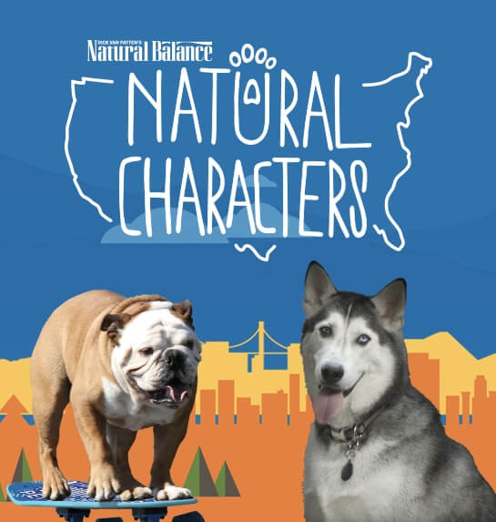
Natural Balance: Natural Characters
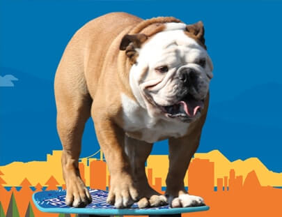
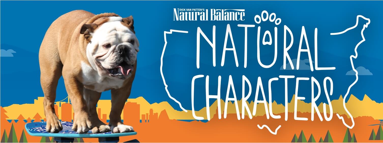
Natural Characters was a campaign launched by Natural Balance Pet Food. The primary goal was to focus on the kooky dogs, cats and other pets that exist throughout the United States. Natural Characters toured across the country to bring these wacky characters to the stage of the world wide web. The Natural Characters microsite was designed as a way to depict Natural Balance’s dedication to pets by showing how they view them. Pets with personality deserve the personal touch when it comes to their nutrition. Black & Red was brought on to craft a site that captured this passion, and created a fun & stimulating environment for pet owners to interact with.
Because the campaign was a live, nationwide tour, we needed to provide a filter for the pet’s origins. Users had the ability to select a region of the United States from which they could select a pet. A custom image uploader was built for pet owners to upload photos, and each pet had their own individual profile page. The site was integrated with a full blown custom content management system for full control of the site with moderation. Included were video embeds, social media connectivity (Facebook, Twitter, Email Share), auto-sorting of page layout based on user-detected region, and an advanced responsive architecture to accommodate the feature-heavy pages and ever growing database of pet profiles.
Project Info
-
 Evolution Bureau
-
 Natural Balance
-
 #Website

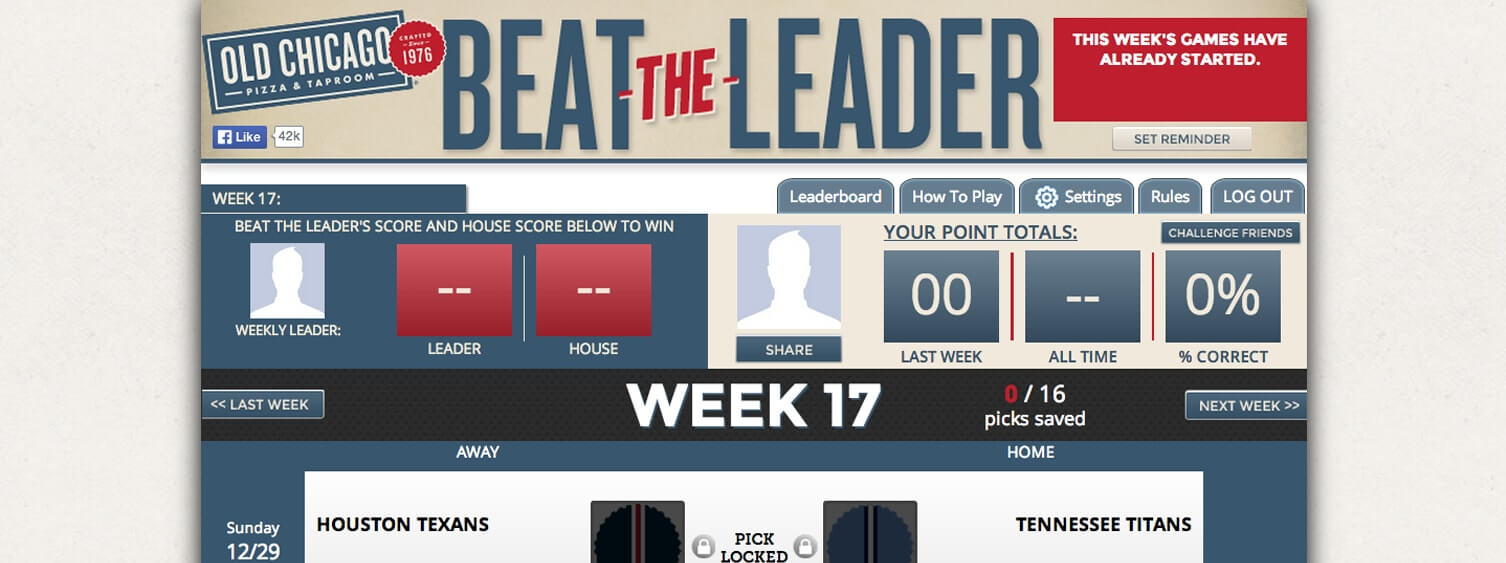
Old Chicago: Beat the Leader
Old Chicago is a popular chain of family-friendly restaurants located throughout the United States. They’re famous for their selection of pizza, Italian entrees and beer. For a period of time, Old Chicago patrons would play a game called Beat the Leader which was a pick em’ style game built around the NFL. In classic pick em’ fashion, patrons would use pen and paper to choose winning teams for that week. As the game picked up steam over the years , Old Chicago decided that a digital approach was needed to take Beat the Leader to the big leagues.
The Beat the Leader Web Site was created to streamline the pick em’ process, create a nationwide player network, and take advantage of social media to enhance brand awareness. The site allowed players to register, make their picks, and manage their accounts online. The user interface was designed with analogue pick em’ sheets in mind, and a simple user experience. Old Chicago could award perks to individuals with winning records and individual restaurants around the country could now compete with each other. This resulted in the extinction of the analog version of the game and a whole new level of Beat the Leader. Additionally, social components were added to give participants a means of competing against their personal friends and family.
Project Info
-
 Movement Strategy
-
 Old Chicago
-
 #Website


Ryder: Ryder.com
This is another example of Black & Red shining when a quickly approaching deadline is souring everyone’s mood. Ryder.com was going through an enterprise-level site redesign, and with only four weeks left in the schedule, their team was falling behind. Black & Red was brought in as mercenaries to help implement a myriad of features in collaboration with the Ryder.com development team. Without enough senior developers on the client’s development team, Black & Red was able to step in at the drop of a dime and provide one of our most experienced senior developers to help.
Global level Javascript module development isn’t a term that we throw around lightly, but effectively all of the modules (over 100 modules) implemented on this particular page now go through Black & Red code. We even made it fully accessible to the visual and audio impaired. This is another one that took many, many hours of hard work, but once again, through sweat and stiff wrists, a fully functioning and impressively crafted site is now accessible through the World Wide Web.
Project Info
-
 CP+B
CP+B
-
 Ryder
Ryder
-
 #Website #Updates
-
 View Project


Charles Schwab: Fee Weight
Black & Red was hired in collaboration with Crispin Porter Bogusky to update existing Schwab landing pages for three different cities: Chicago, Seattle, DC, and Dallas. With multiple offices in each city, the site need to geolocate users, and provide appropriate maps on the landing page for clients to see all of their local Schwab branches. The UI was also updated with new content, copy, and contact options for users. The final product reflects only a fraction of the work required as we produced a number of example pages from which the client chose.
Project Info
-
 CP+B
CP+B
-
 Charles Schwab
-
 #Website

Street League: Trick of the Year
Street League Skateboarding had a brilliant idea. They began to feel a rift forming between professional skateboarding and the community that elevated it. They needed a way to bridge the gap and lift the community to level of the pros. What they came up with was Trick of the Year: an Instagram based, six month-long competition allowing users of all skill levels to upload their best trick for a shot at winning the title of Trick of the Year (as well as a $10,000.00 piece of equipment of the skater’s choosing). After users authenticated their Instagram accounts through the site, a custom scraper would pull their hashtagged videos into a content management system (CMS), for posting to the site. Full moderation capabilities were available through the CMS. Riders and viewers would visit the site throughout the competition and vote for tricks they felt worthy of the title.
With Trick of the Year, Black & Red started with a blank canvas and worked from the ground up. Black & Red designed the full user interface to make it flow simply on the surface, and built an elegant back end CMS behind the scenes to help keep things running smoothly. Trick of the Year utilized a vote-to-promote system where users with an Instagram account could view a continuous stream of content. Reddit-style up-vote & down-vote algorithms were used to keep the rankings fluid and ever changing. Each post was a video and each user had one vote per video. The site was used as a brand awareness asset for Street League, as well as an exciting promotional tool for several large skating events throughout 2015. Street League received world-wide participation in the online competition!
Project Info
-
 Street League Skatboarding
-
 Street League Skatboarding
-
 #Website
-
 View Project


Warren Miller: Ticket to Ride
With each passing year, the world is blessed with a new Warren Miller Entertainment (WME) film. In 2013, the studio produced the film Ticket to Ride, featuring an exhilarating worldwide tour of exotic locations with the world’s best skiers and snowboarders. To promote the film, WME set out on a special screening tour across the United States and beyond. Wanting to spread the word of their adventure, WME asked Black & Red to build a tour site that would allow users to find details about local screenings.
Ticket to Ride was featured in a number of different venues. The tour website allowed followers to type in their zip code and find out where the closest screening would be and when. Users could also purchase their tickets online for the show in advance. With so many screenings, WME needed to input their own info on the fly. To do this, a seamless content management system was implemented on the site that also updated the WME Facebook page. It was quite a ride.
Project Info
-
 Movement Strategy
-
 Warren Miller
-
 #FacebookApp

VFW: Mane Event
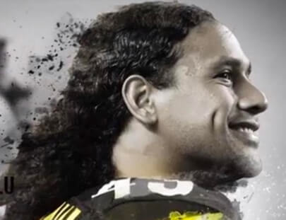
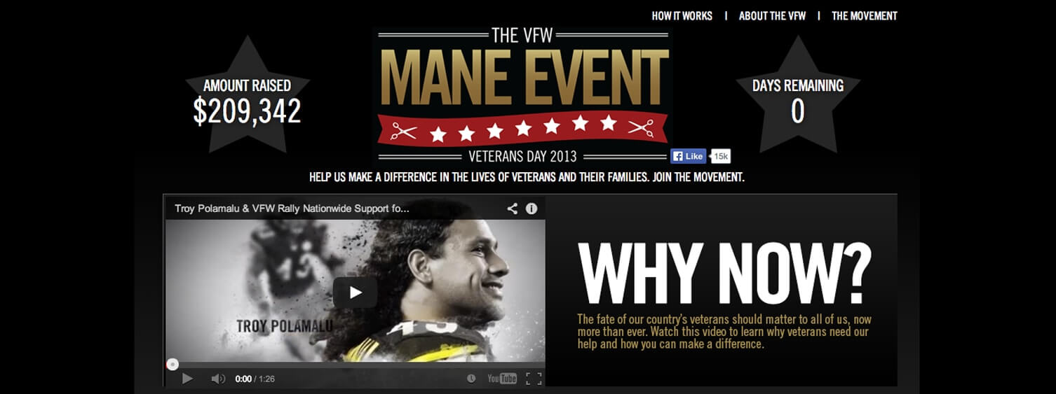
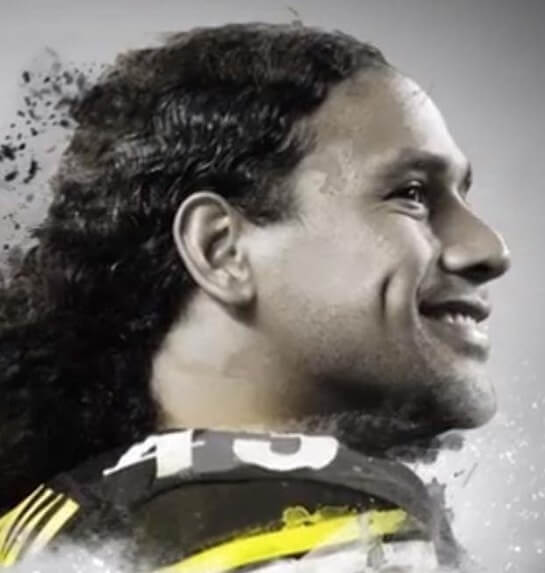
In association with Supercuts and Head and Shoulders, Veterans of Foreign Wars came up with the concept of promoting donations with hair... Well, not directly. The notion was that users could challenge each other into specific haircuts after certain donation goals were reached. The entire campaign featured Troy Polamalu (of NFL fame) as the poster child through Head and Shoulders. The VFW went to Black & Red and MVMT Strategy to turn this idea into a reality.
The site made use of a few key features to make it work properly. First, there was the Facebook component that needed to be added. Users could challenge each other officially through a Facebook app and make it public. The other component was the implementation of a donation API that calculated and concatenated the donations made by users, and an instructional video embed featuring the flowing locks of Troy Polamalu.
Project Info
-
 Movement Strategy
-
 Veterans of Foreign Wars
-
 #Website

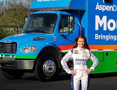
Aspen Dental: AspenDental.com
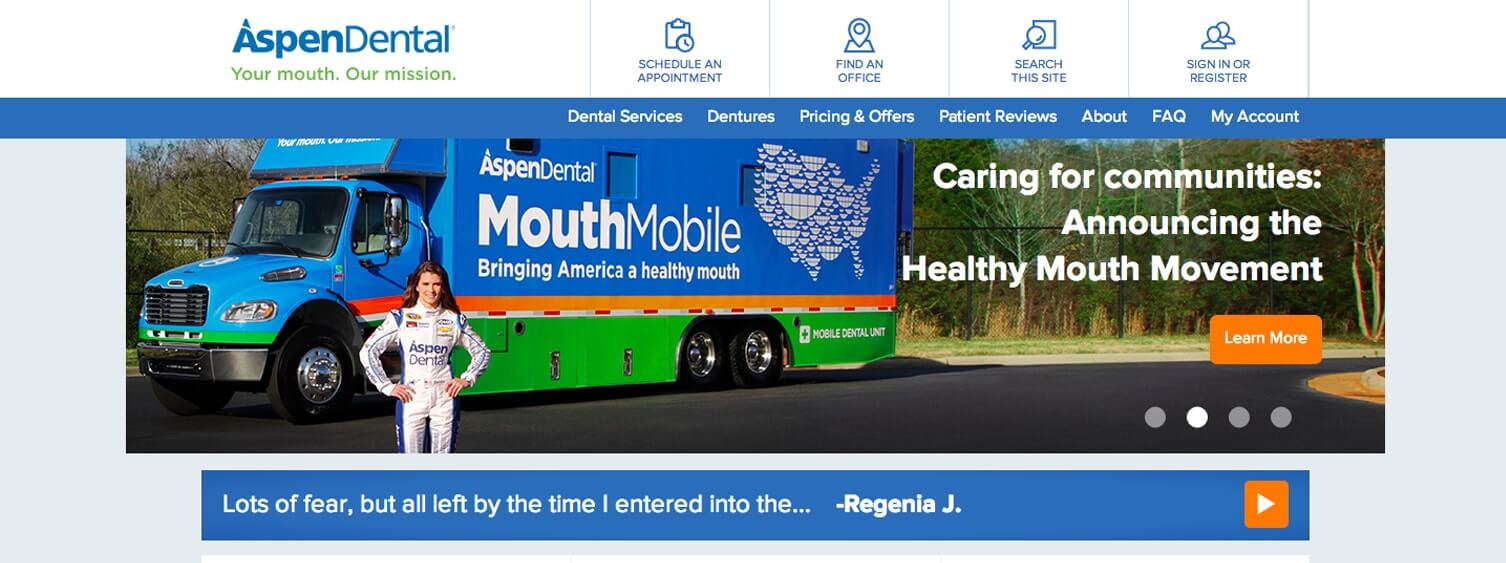
Aspen Dental remains one of Black & Red’s longest ongoing projects. As one of the largest dental chains in America (Spanning 20 states nationwide), the Aspen Dental website required many, very specific features that operated with unflinching accuracy. For roughly two years, Black & Red completed all maintenance on the site, comprised of monthly updates. We worked on updates as requested and implemented an array of features that allowed for organization, scheduling, reminders and much more. We also did a series of microsite promotions such as the Healthy Mouth Movement and Taste of the Future. The site was location specific and offered different experiences depending on the geolocation of the user. The Aspen Dental website also provided the means for users to schedule an appointment to their specific Aspen Dental office (of the more than 500 offices nationwide). Black & Red owned all Aspen Dental maintenance and promotional work throughout 2014 and 2015.
Project Info
-
 CP+B
CP+B
-
 Aspen Dental
-
 #Website

Spark: Homepage
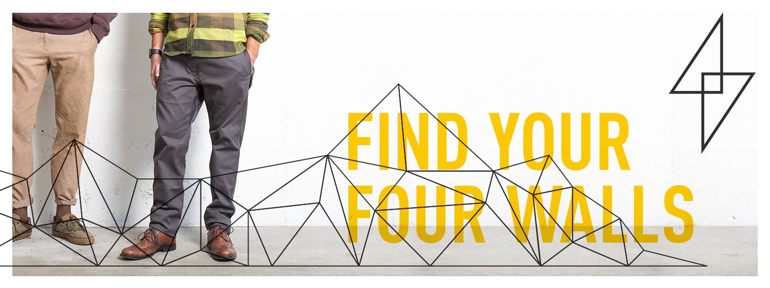
S’PARK, a housing development set to open in 2018 in Boulder, incorporates luxury condos, affordable housing and commercial retail space in the same complex. It was built on the notion that retail, office and residential spaces work best when they can coexist and collaborate.
To promote their innovative housing ideas, the founders at S’PARK envisioned cutting-edge marketing that would appeal Boulderites -- present and future, young and old.
To showcase the look and feel of the concept behind S’PARK, Victors & Spoils came to Black & Red to build a modern, tastefully designed website focused on cutting-edge UX and fun animation. Black & Red built a site with a simple, impressively designed layout that showcased cutting-edge page navigation with HTML5 animations overlaid. We accomplished an elegant balance of UX and design that truly captures S’PARK’s brand and vision, and allows users to envision what it will be like to live and work at S’PARK.
Project Info
-
 Victors & Spoils
-
 Spark Neighborhood
-
 #Website
-
 View Project

Greenstone: Official Site
Green Stone is a strategy and design firm specializing in user interface (UI) and user experience (UX). With so much emphasis on design and detail, Green Stone wanted a new, cutting-edge, harmoniously designed website, so came to Black & Red with plans for a site that would come to include custom animations and complex code.
In just three weeks, Black & Red was able to create a site that showcased innovative and cutting-edge UX elements, custom header animations, seamless color transitions between sections and smooth flow from start to finish. With this project, Black & Red pushed front-end limits and boundaries, and truly got the chance to showcase our development prowess.
Project Info
-
 Greenstone
-
 Greenstone
-
 #Website, Interactive

Whole Foods: Hennepin
Whole Foods was opening a new store in Minneapolis, and wanted to spread the news about opening day on social media. Movement Strategy commissioned Black & Red to build a simple embedded Facebook app to engage users in a promotional giveaway with a gamified questionnaire and mailing list application.
Project Info
-
 Movement Strategy
-
 Whole Foods
-
 #Website
